Need to optimize your website or landing page in a hurry?
While there’s no one-size-fits-all approach to conversion optimization, there are some recurring recommendations that come up again and again when I’m consulting with clients.
And in this article, I break down seven such landing page optimization tips for you, one-by-one.
Each tip is based off my 7 Question Landing Page Framework, and backed by years of data and testing.
Let’s go!
Focus on clarity
Simplify the above-the-fold section of your landing page to focus on one main thought (headline), a subheadline that goes into more detail, and one clear call-to-action.
Here’s what an unclear headline looks like:
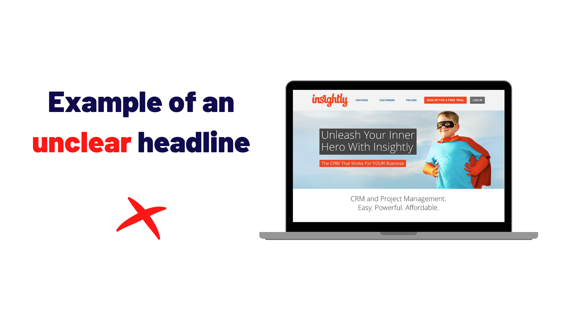
If you just read the headline, would you have any idea what this company does?
Now, on the flip side, what do you think of this headline:

It’s pretty clear right away that this tool helps you sell stuff online.
Increase the relevance
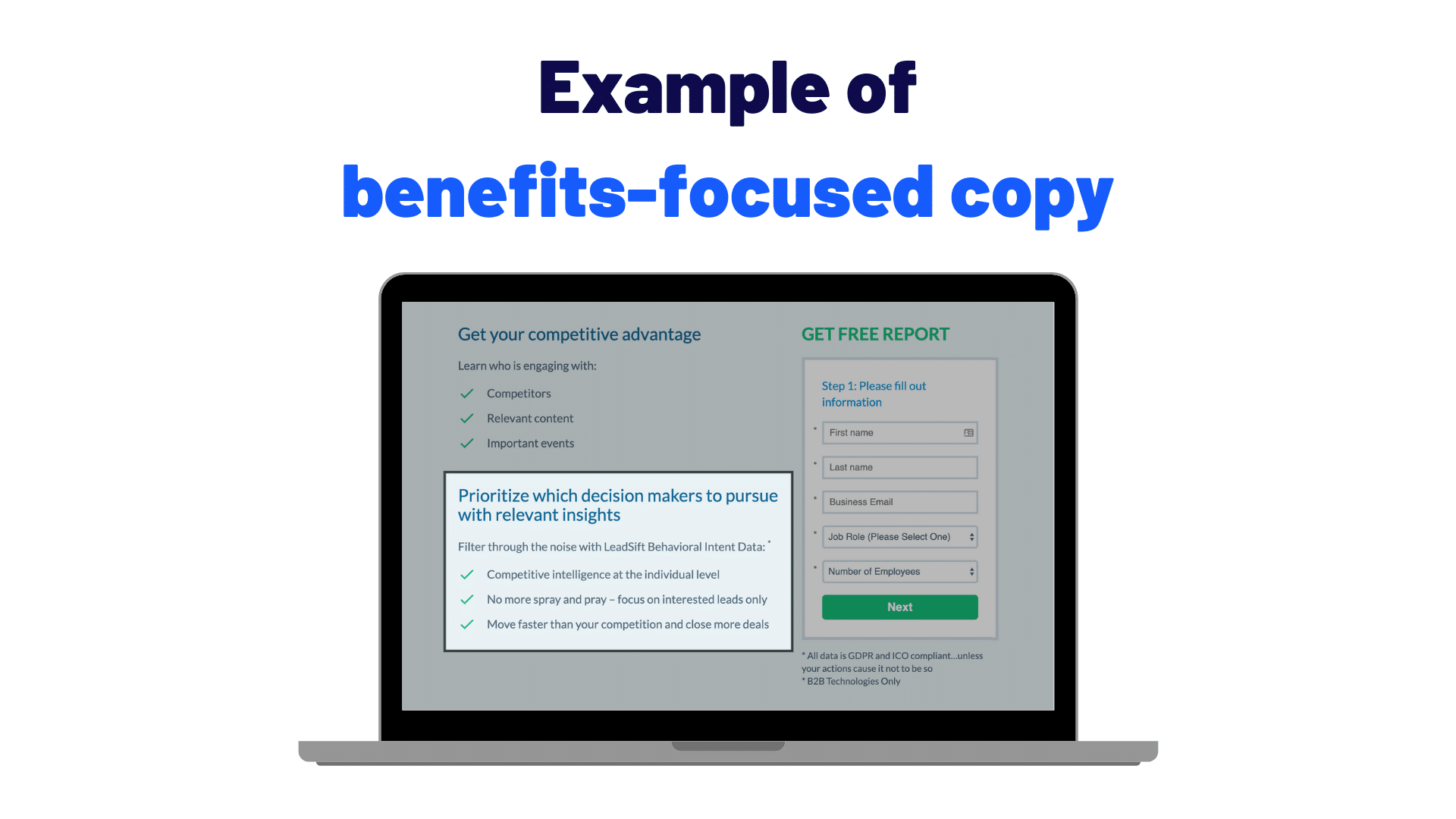
Focus less on the features and more on benefits and outcomes that show the visitor how your offer will solve their problem.
This landing page below does a good job of focusing on the benefits for their sales tool, by mentioning stuff like “prioritize which decision makers to pursue with relevant insights:”
Create strong affinity
Design your page in a way that is easy-to-use, easy-to-navigate, looks great on mobile, has legible typography, consistent colors, and authentic images.
Creating a sense of affinity is not easy, but when you nail it, you know right away.
Here are two pages side-by-side:
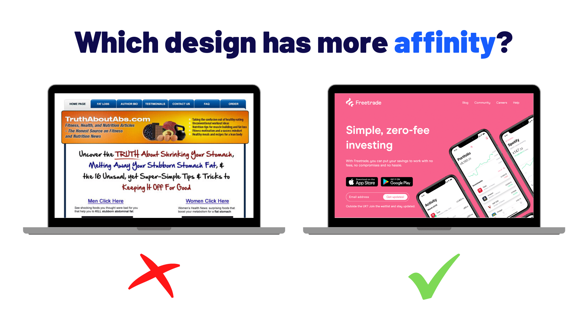
Don’t you simply like one way better than the other, even if you can’t explain exactly why?
Showcase your influence
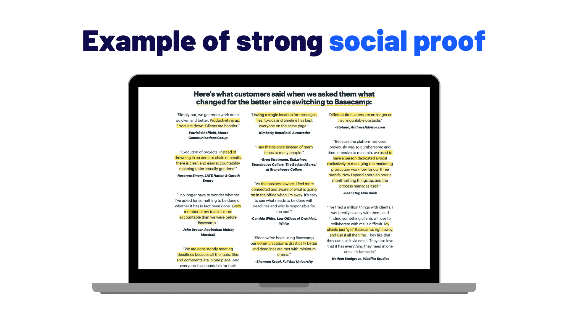
Add social proof to your page with testimonials, case studies, numbers of customers/clients, etc.
One company that goes above and beyond with their social proof is Basecamp. Look at all of those testimonials:
Build up trust
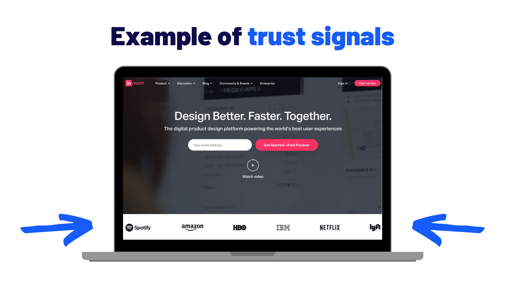
Increase the perception of trust by adding trust indicators, badges, certifications, affiliations, and other quantifiable stats such as the number of years in business.
InVision does a great job of showcasing some well-known trust signals below the hero section:
Mention an advantage
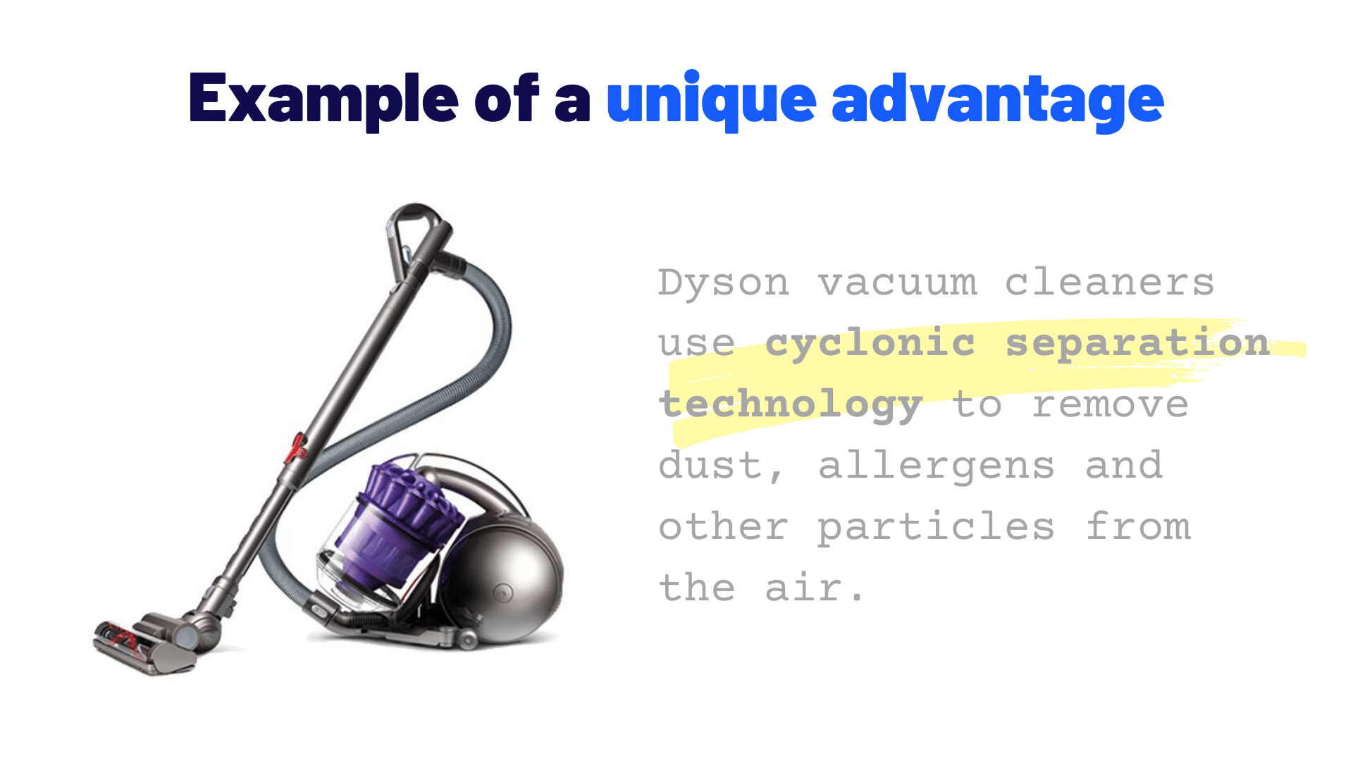
Make sure to mention your unique advantage that highlights something special about your offer/product/service to address how your solution is different from other options.
My favorite example of a unique advantage is Dyson and their “cyclone technology:”
Make it easy to take action
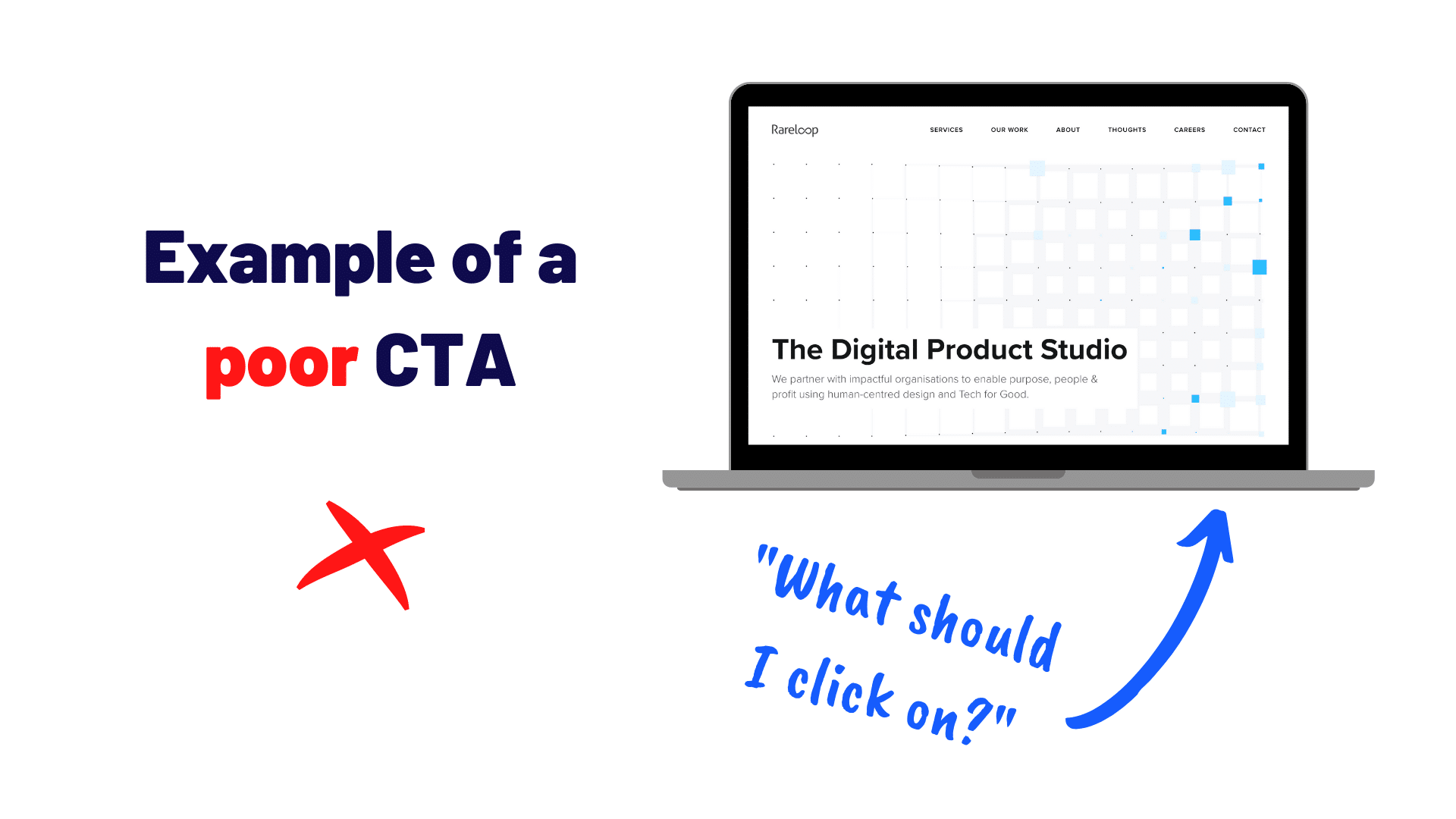
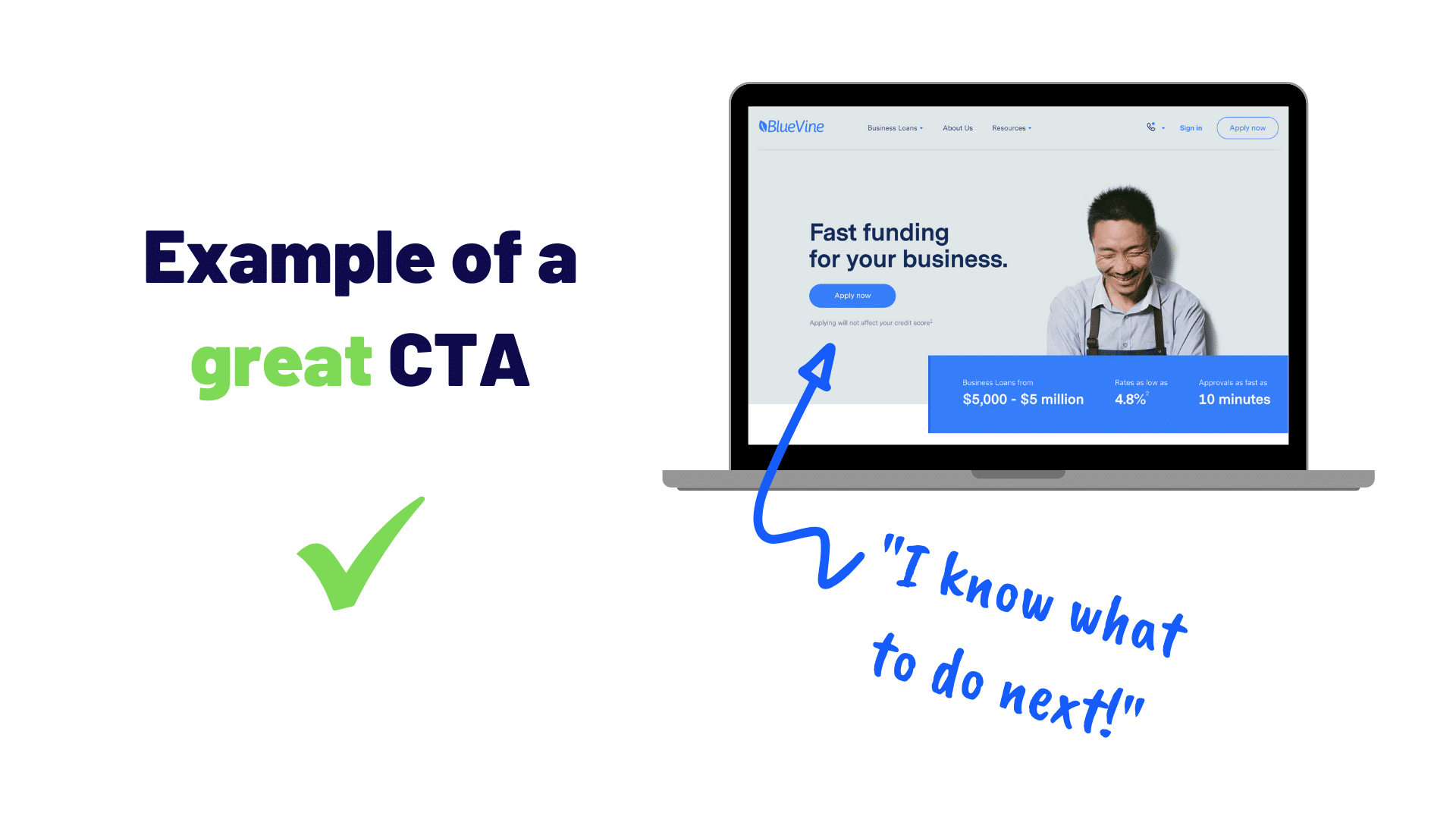
Repeat your call-to-action several times throughout the page using a contrasting color/style to make it stand out, especially mentioning it at the top and bottom sections.
Here’s an above-the-fold portion of a site that has literally no visible call-to-action in their hero section:
On the other hand, this financial services company makes it super easy to understand exactly what they want you to do next:
The “7 Question” Landing Page Framework
If you’ve been reading my blog for a while, or listening to my podcasts, you might realize a recurring theme here.
Each landing page optimization tip I shared above is directly related to one of the questions in my 7 Question Landing Page Framework.
Get instant access to the free guide here.
So, there you have it! With the landing page optimization tips I shared above and my 7 Question Landing Page Framework, you’re well on your way to higher-converting landing pages.
PS: Sharing is caring. ❤️ If you found this article helpful, give it a quick share on Twitter. Here’s a ready-to-go tweet for you! 👇


